This blog on skip links is a continuation of our series, looking into what comparisons can be made between inaccessible elements on websites, which was inspired by an AXSChat Podcast.
After finishing my original blog, I decided to expand and tell you a bit more about specific areas of assistive technology features that should be used and accessible within a digital platform. This should be the case whether on a website, a document, or any other digital information.
In this specific blog, we discuss how skip link features aid with accessibility.
What is a Skip Feature on a Website?
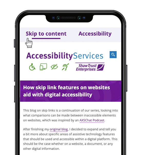
Often, people may either miss this link or have never heard of it before, especially if they use a mouse to access digital platforms. The skip facility is a great tool for either keyboard users, people who use magnification, or screen reader users.
On activating a skip link, the cursor jumps over the templated header and lands on the main part of the page. This allows users to bypass items such as menu navigation to gain instant access to the page’s main body of text.
The navigational links that form a templated header are great for informational direction, allowing users to visit the main topics on a website swiftly. However, as they are found on every web page, the probability is that the site visitor has already read them and wants to get down to the information they seek. Mouse users can easily find this information by scanning a page using their eyes, but some people have to use a keyboard to navigate around websites and without a skip link, this can be time-consuming.
Accessibility Issues With Skip Links
Sometimes, when our team tests skip link features on a platform, the cursor falls short of the beginning of the web page content. This would result in a person having to work out where the cursor has landed on a web page, and they would then have to redirect themselves to the main content.
A Comparison to Get You Thinking About the Need for Skip Links
To give you a little more context about the need for accessible skip-to-content links, here is an everyday comparison.
Imagine that you enter a post office and you are the only customer there; however, in front of you is one of those zig-zag queuing, controlling barriers. Looking at it, you will have to walk quite far to get to the counter, but as there is no one else there, it should be much simpler and quicker to get to the front desk. So, let’s think about that like a website with no skip link.
Now think about the opposite, where there has been a barrier removed. This would enable you to be able to go straight to the counter, which is much easier. This would work like a skip link.
Now imagine that you get to the post office, and there is no one else there, and a barrier has been moved out of the way. This means that you don’t seem to have to go through the zigzag queuing control; however, halfway down the direct route, you discover that you must join the last zig-zag to get to the information desk. This is still challenging, as the barrier was taken away to make it easier for you, but you still didn’t have instant access to the counter. How annoying would it then be if the assistant said that you needed the counter to the right when you got to the counter? However, to be able to get there, you have to go to the back of the queue and follow the zig-zag queueing control, even though there is no one else in the post office.
This is why skip links are so useful when they are correctly implemented online.
How to Find the Skip Link Feature on Websites and Why They May Also Be of Use For Mobile Ssers
Next time you are on a website, have a look and see if you can locate the skip link. Another issue is that skip links can be heard by a screen reader user and not seen by other users.
Mouse computer users may not realise that a skip link is at the top of a web page. However, looking closely on mobile sites when using a smartphone, you may see this tool. On activation, this should jump you to the main article on a web page instead of you having to scroll through on your screen to get to the main information you are seeking.
Eliminating Inaccessible Digital Platforms
I know I have used this last paragraph at the end of each of this series of blogs, but it relays the important message of all the blogs written:
These are just a few comparisons between most people’s everyday life experiences and one of the inaccessible features of digital information in their lives. However, there really is no need for any inaccessible areas, as there are always alternatives.
Think about when you could not get access to something. Whether it is in a shop or around your normal life experiences. There is no real reason why you should not be able to gain access. It is usually due to someone having made it inaccessible to you because of the design and not thinking of your individual needs as a customer in a specific situation.
It’s time to make a change and be inclusive.
Over the next few months, I’ll be blogging about ways that you can adapt your websites to achieve digital accessibility and improve the user experience for everyone.
For more details about how we can help with website accessibility testing, please get in touch with our team today.


