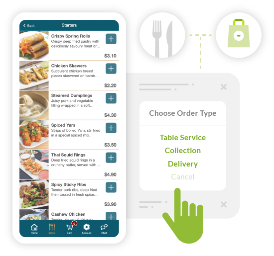
The ‘Technical Age’ of Ordering Food
Ordering food, or looking at restaurants menus online or other digital platforms:
Wow, how much has technology moved on to quickly give information to people and allow a quicker service and tracking. I remember back in the day, when either you rang a takeaway and ordered the food, or just went to the takeaway, to order it and in both ways, you had to do what the term said: ‘take away’. Then there was delivery, take away with someone taking it away for you and giving it to you while warm in the house.
Jumping forward again to our technical age, it is so easy for everyone to check on what there is around where you live and choose either to stay in, or go out, with some knowledge on what you may want to eat then either ordering or getting there if you are eating out.
Ordering Online or In-App as a Blind User
When I say, easier for everyone, potentially, but as a person who can’t see, I enter each site, or app with trepidation. If I go on to one of these services, it may not work straight from the offset and therefore is inaccessible, which in a way, is better than going through the process, picking my meal and then finding out that the last process is inaccessible.
These are getting better and here at Accessibility Services, we are helping sites to make the process accessible from the start to the end.
Here are some issues that I may come across, but the list will not cover everything:
- No headings on the page, or very limited. If you imagine that you have to wait a second on a site for a description of a take away item, then wait another second for another option. Now times this for every food item that you may come across on your favourite app. this is the best way of illustrating the concept of having no style headings on a menu. If the style headings were introduced, a screen reader user can then jump from burgers, pizzas, or kebabs for example. A greater use within these subjects/items, will increase the accessibility for the site.
- Choices. What about, options within the choice: like, what sauce would you like? If the item was at the top of the page, then the options then popped up at the bottom of the page, then a screen reader user will not relay this and wonder why the order did not go through. Perhaps, even a sighted person will not realise this if it is on another page out of scope of the user’s sight.
- Inaccessible fields, this may be in choosing your food option, or like I said, the end of the process by acknowledging the order, or payment.
These three issues will prevent a person from ordering their takeaway.
No Reason For Online Apps or Websites to be Inaccessible
The frustration is that there is no reason why these sites can’t be accessible, just correct accessible coding within the site.
The same is for looking up menus and booking a table at restaurants.
The same issues are for using the site to book a table, as for the takeaway, with headings and fields can prevent a table from being booked,
Although there is a number to book the old fashioned way, by using the phone to talk into. However, the reason for the ease of booking tables online is so the staff that they have can concentrate on the people that are there eating, therefore, answering the phone in this day and age, may not be on top of their list of jobs to do.
Looking at a menu before going out, is a great help for me, as I can spend my own time looking over it and selecting what I fancy to eat at the restaurant. I do have to have some realisation in this, as there has been a time, or two, where they have not got what I had wanted when reading the menu online. But saying that, I still have an idea, or normally a second choice.
However, not all of the menus are accessible. Just like choosing your food from a takeaway menu, if there are no headings, then it is difficult. The main issue concerning menus is those that are in PDF format. Now, PDFs can be accessible if they are produced correctly. Also some documents, words are pushed together, which makes it difficult to read, some with pictures to describe the choice, which then dangles the carrot for a screen reader user. With a title of the food, but no description and with some of the creative wording to some items, you need a description to work out what it is.
The third way is that they have scanned the menu in as a picture, which will be no good for a Screen Reader user, as there is no text to read.
Encourage Restaurant Owners to Invest in Accessible Tech
It sounds like I am moaning, well I suppose I am. Now don’t get me wrong, I am grateful that technology has progressed and will allow me to read lots of menus and feel independent, but the issues that people come across, are not ones that can’t be fixed if they wanted to.
However, do they know, that a person that can’t see, can actually know what is on a website?
Perhaps, you know someone, are a restaurant owner or know someone in the industry that may be interested in how to make their website more accessible for all, not just a person who can’t see, but for other people that may have difficulty in accessing the menus.


